A Comprehensive Guide on What to Put on a Business Card
Business cards are part and parcel of almost every industry imaginable and are an important tool in making connections and growing your professional network. But if you're a solo entrepreneur or small business, it can be a daunting task to design one by yourself.
You may not be entirely sure what's normal to include on a business card or maybe you're looking for a way to take things to the next level. So today, we've put together a comprehensive guide on what to put on a business card!
Part 1: What to Put on a Business Card?
Still not sure what to include on your business card, or how to choose the information to put on your business card? This part will share the key information to put on business cards.
Importance | Info | Details |
Essential | Your Name | Full name; consider titles or degrees for professional context |
Job Title/Position | Clear reflection of your role; specific and professional | |
Contact Information | Primary contact number; | |
Company Name & Logo | Full company name; can include logo for branding | |
Whitespace | Blank space for it easy to read and take notes | |
Optional | Tagline or Slogan | Brief phrase that indicates what your company does or a slogan |
Social Media Handles | Relevant platforms (LinkedIn, Instagram, TikTok, etc.); professional accounts only. | |
QR Code | More and value-added info to show to recipients | |
Physical Address/Map | Office address; relevant for businesses with physical locations |
Your Name (Essential)
First and foremost, the most important field in any business card is your name. You'll want to keep it to the point and avoid any 'extras' in this field. You want card receivers to be able to quickly glance at your card to know whose card it is.
If your name is a bit too long for a business card, consider shortening it. For example, if you have a 'middle' name, it's not required to include it on your business card.
In addition, consider include the title before your name, such as DR., Ph.D., Esq., etc., which will help people learn about your job/industry at the first glance.
The image below is an example of putting name with title on a business card, including a middle name.

Image from Pinterest
Job Title/Position (Essential)
The next pertinent information on your business card will be your job title and position.. This is an important field to include as it allows card receivers to properly gauge your role.
Typically, your job title usually follows your name and is situated right after or under your name.
If you're a solo entrepreneur, freelancer, or small business and don't have a 'dedicated' position, you can include any position you think fits your role best. For example, you could use 'Proprietor' or 'CEO' if you're the owner of the business.
Contact Information (Selected)
Next, you should include the most pertinent contact information. This can include:
1. Phone Number: It can be direct lines, mobile numbers, or office extensions. One thing to remember is to format the number for international contacts.
2. Email Address: Ensure to use a professional email address, aligning with your company name. For example, I'm an editor working at AirDroid, my email address on the business card would be using @airdroid.com. Using @gmail.com is not wrong, but not professional enough.
3. Fax Number: This may be obsolete for most companies, but it is still relevant in industries like legal or healthcare.
If you have simply too many contact details to include, try to narrow it down to your most used details. If you have a dedicated phone for work, use that number, or use a work email instead of your personal email address.
Company Name & Logo (Essential)
Somewhere on the business card, you should have your company's name or logo. This is so card receivers can identify your brand and company immediately when looking at your business card.
This helps spread brand awareness and allows potential clients/partners to learn more about your company. Make sure the front of the card has at least a field dedicated to the company name.
If you're out of space, you can also put your company's logo front and center on the rear of the card, or incorporate the logo into the background by using a subtle, low-opacity version of the logo as a background element.
Here's an example on how to put your company name and logo on your business card:
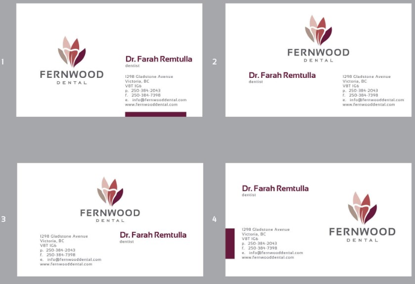
Image from crowdspring
Tagline or Slogan (Optional)
In addition to your company name/logo, it should be accompanied by a brief phrase that indicates what your company does or a slogan that represents your brand. This part is mainly up to your preference and how you want your company to be perceived.
You could include a motto that adheres to your company's values, or maybe a more literal interpretation that highlights your company's products and services. This should supplement your existing information on the card that your company name and other information don't explicitly say.
Social Media Handles (Optional but Recommended)
Apart from the more standard contact information, if you have a sizable following on Instagram or a Facebook page, it's a good idea to include that on your business card too. This translates to a more trustworthy relationship between your company and clients/partners.
However, that doesn't mean that you can put whatever social media platforms casually, but choose the right platform(s) based on the industry, and the one that best presents you or your brand.
Just include the logo or name of the social media platform in one of the text fields below your email/number with the @ handle of your account.
For example, you can put LinkedIn or Instagram on your business card.
Physical Address/Map (Optional)
At the bottom of your business card, you should also include an address to your company office.
If you have a retail outlet, storefronts, or local businesses, which require your clients to come over to your office frequently, you can also include a small map with directions to your office. This is especially helpful for offices which may be harder to reach or find.
QR Code (Optional)
If you have a website or social media account that card receivers should check out to learn more, link a QR code, and include it on your business card. This way, clients don't need to manually search for your pages and can just scan the QR code.
You can also link the QR code to a digital or AI business card for people who want to learn more about you and your company. This is a great way to communicate to card receivers extra information that can't be included on the physical business card.
Here's an example on how to put QR code on your business card:
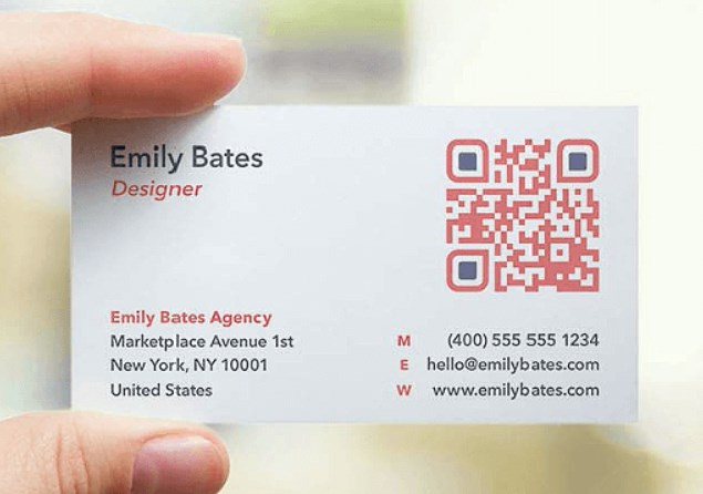
Image from QR Code Generator
Whitespace (Essential)
By 'white space', what we mean here is the empty spaces around your card that don't include any text or design elements.
Don't be pressured to fill up every nook and cranny on the card. Leaving plentiful space between text fields and other design elements is a great way to keep the card sharp and aesthetically pleasing without overwhelming your card receivers.
Part 2: 5 Tips for Designing a Business Card
After learning the basic information to put on business card, next we will outline some tips and tricks to help you design your business card.
Keep It Simple
While a well-designed business card is a great way to wow clients, there's a fine line between a 'good' design and an overcomplicated mess. Try to toe the line by making it unique with great design elements and aesthetically pleasing dimensions while keeping it informative.
Try not to go overboard since the main purpose of your business card is to share your contact details as efficiently as possible. Overcrowding the card with intrusive elements could backfire on your card's readability, which is a big no-no.
Consistent Branding
Make sure your business card is designed to stay consistent with your company's branding. This includes using similar colors to your company's logo and brand, using the same typeface for your slogans/naming conventions, etc.
Also, consider your brand's visual style. Is it minimalist, bold, or playful? Incorporate that into your business card to build a cohesive brand that's easy to recognize & recall, making your business card an extension of your marketing strategy.
Quality Material
When it comes to business cards, the in-hand feel is just as important as the looks.
The weight and texture of the card can greatly enhance how the card feels, resulting in a 'premium' feeling card. Play around with textures like matte or glossy finishes to help leave a memorable first impression with just your card.
Consider Two-sided Template
So far, we've mentioned mostly the front of your business card, but you've got two sides to work with. While the front should focus on detailing all your relevant contact information, the back is free space to work with.
Here's where you can include additional design elements, your company logo & slogan, or a QR code linked to your website. A two-sided design also allows for more creative layouts without cluttering the card.
Add Something Special
Lastly, add something 'special' to make your business card truly stand out.
Special features can include:
- The card's shape
- A fold-out design
- Special inks
- An embossed logo
- Foil stamping for an elegant touch
- Embossing and debossing for texture and emphasis
- The use of 'unique' materials like wood, metal, or seed paper
But whatever you choose to include as your 'special' feature about the card, make sure that it aligns with your brand identity.
Part 3: Common Mistakes to Avoid
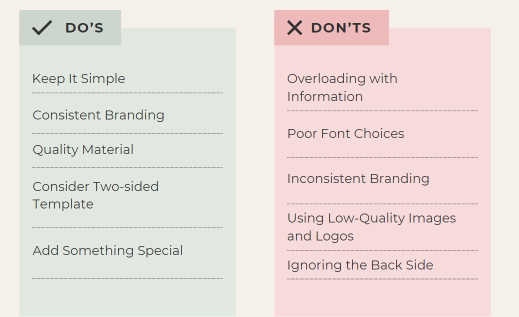
We also summarize the commonly-seen mistakes that people would make when designing a business card.
Overloading with Information
We fully understand that you might want to include as much information as possible on the business card to fully express yourself or your brand, but it's never recommended to overload with information, as including too much text or too many details can make the business card cluttered and hard to read.
Simply prioritize essential information and keep the design clean and minimalistic.
Poor Font Choices
Some people, especially people in the artistic industries, may use hard-to-read or overly decorative fonts. It's important to balance the creativity and readability.
Inconsistent Branding
Never use colors, fonts, or logos that don't match your company's branding.
If your company has a logo and a color scheme, use the fonts and colors that align with your overall brand identity for a cohesive look.
Using Low-Quality Images and Logos
Pixelated or blurry images and logos indicate low-quality business cards and probably result in business cards being thrown away. In fact, 88% of physical business cards are thrown away in less than a week, so it's important to level up your business card with high-quality elements for clear and professional visuals.
Ignoring the Back Side
Most people may not realize the importance of the back side of the business card, leaving the back side of the card blank or underutilized.
If you want to include more information, branding, or a unique design element without overcrowding, use the back side, especially for additional information, such as brand logo and tagline, QR code, or something else.
Part 4: Level Up Business Card Networking with AI
Are you struggling with deciding what information to put on business cards? Are you having difficulty in knowing how to organize the information to make it clean and outstanding? Or are you worried that your business card may not impressive at the first glance?
Well, ChatInsight AI Business Cards can resolve all the problems for you. It's a great way to conveniently share additional information and leave memorable impression.
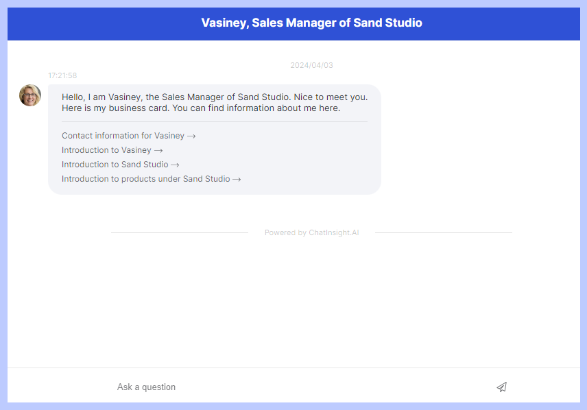
Key Features:
- A powerful AI assistant to handle all customer queries and answer FAQs.
- It allows you to make any relevant changes and have it reflected in real time!
- It will keep track of your conversations to collect contact preferences and other engagement metrics.





Leave a Reply.